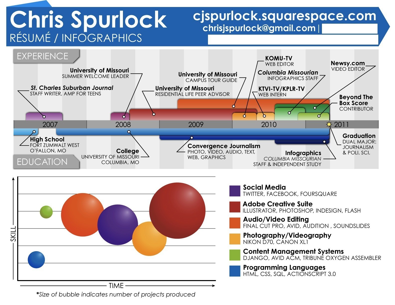
 Everyone is looking for a way to make their resume stand out in today’s job market. One way to do that is by giving your resume some visual appeal. Well-designed resumes with color and images can attract attention over those with plain old text.
That’s not to say everyone should add pictures to their resume. A graphical layout might not be for everyone, nor appropriate for every profession and industry. And if you don’t have an artist’s eye (or a favor to call in to a graphic designer), attempting something like this might not work out to your advantage.
But if you know what you’re doing, and need a little inspiration, here are 10 digital resumes with some very cool visuals.
1. Give the Reader Your History
A key element of a resume is your professional background — where you started, where you are now, and the places in between. Resumes with maps or infographics provide the same chronology of information, but with a bit more flair.

Michael Anderson’s infographic resume turns his employment and academic history into a colorful visual journey.

Ozgur Alaz thought to plot his job history on Google Earth rather than on a list of text bullets.
2. Aesthetics Matter

These graphical examples use design compel the reader to explore it now, rather than later.

Pau Morgan turned her CV into a clean, modern chart that is engaging, yet easy on the eyes.

Graphic designer Tudor Deleanu brings color and texture into what would otherwise be a simple list of previous employers.
3. Make It Personal
Traditional resumes can be “humanized” by a well-written cover letter. Graphical resumes can add a whole new dimension by visually introducing the person behind the experience.

Federico Moral went with an anthropological theme, placing his skills into the timeline of human evolution.

Francis Homo turns his own silhouette into a frame for his achievements.

Brandon Kleinman adds a really creative twist by making a short presentation out of his Facebook photos.
4. Use Graphics to Inform
Images can be used to tell an employer something about the resume before the first word is even read. The message could be “I’m a game designer,” or “I work in the food industry.” An image related to the profession or industry sends a message right away and can encourage the reader to learn more.

Illustrator and animator Sean McNally pours his gaming roots into this clever CV.

Designer Jason Takeuchi built this artful resume template around food — a great way to introduce yourself to those in the restaurant biz.
Conclusion
Deciding between a traditional text or graphically designed resume really depends on your profession and industry. Just throwing an image on the page will do little to set your resume apart from others. There has to be some thought behind the message you want to send. When incorporating design elements, remember to keep on task and consider the reader’s first impression.
What other resume design tips are important to keep in mind? Leave us your comments.

1 comment:
www0626
ugg outlet
ray ban sunglasses
oakley sunglasses
pandora charms
gucci outlet
oakley sunglasses
ray ban sunglasses
denver broncos jerseys
pandora jewelry
coach outlet
Post a Comment