Bootstrap 3: Why all the hype?

Bootstrap is a front-end framework, which is basically just a few CSS and JavaScript files that help you build websites more quickly by purposely making some core decisions for you, and by including a lot of helpful, pre-made widgets and components. Since it’s all CSS and JavaScript, Bootstrap’s completely customizable, so there’s no harm in using it as a starting point.
I decided to use Bootstrap 3, which was released a few months ago, on some new personal projects and I’ve been very happy with the decision. There’s a lot packed into Bootstrap, but I’d like to highlight the things that have impressed me the most. If you’re still undecided or if you’re new to using front-end frameworks, hopefully this will help you understand what all the hype is about.
Matte Paint Job
Bootstrap 3 introduced a new “flat” design. Yes, it’s trendy, but it also serves two important functional purposes. First, it strips away some of the aesthetic flourishes which makes it easier to customize for your own purposes. Second, it dramatically improves the repaint time, which is basically how long it takes the browser to “draw” all the elements on a webpage.
How much faster, exactly? Paul Irish demonstrates in this video:
Four Grid Systems? WTF?
Well, not exactly. Bootstrap 3 has one grid system but with four different levels of ”responsiveness” for lack of a better term. Here’s the grid system documentation, but if you’re too lazy to click through (which is me a lot of the time) here’s the breakdown:
.col-xs-When two or more of these columns are in the same row, they will always remain side-by-side, even on the smallest mobile screens. Most of the time you’ll want your columns to stack on mobile devices, so use this only when you have a very specific reason to maintain columns on mobile devices. These are also the only column type that cannot be nested..col-sm-These columns are collapsed to start, but become horizontal at widths of 768px and above..col-md-These columns are collapsed to start, but become horizontal at widths of 992px and above. These are a good default to use for just about every column. Once you have your rough layout, you can start to tweak things with some of the other column types..col-lg-Again, collapsed to start, but horizontal at 1200px and above. This is useful if you have an element that normally stretches the full width of the page, but might look ridiculous across a 27″ iMac screen.
It gets a little more complex if you’re nesting elements, using two grid classes on a single column, and so on. I won’t go into that here, but the documentation covers it well.
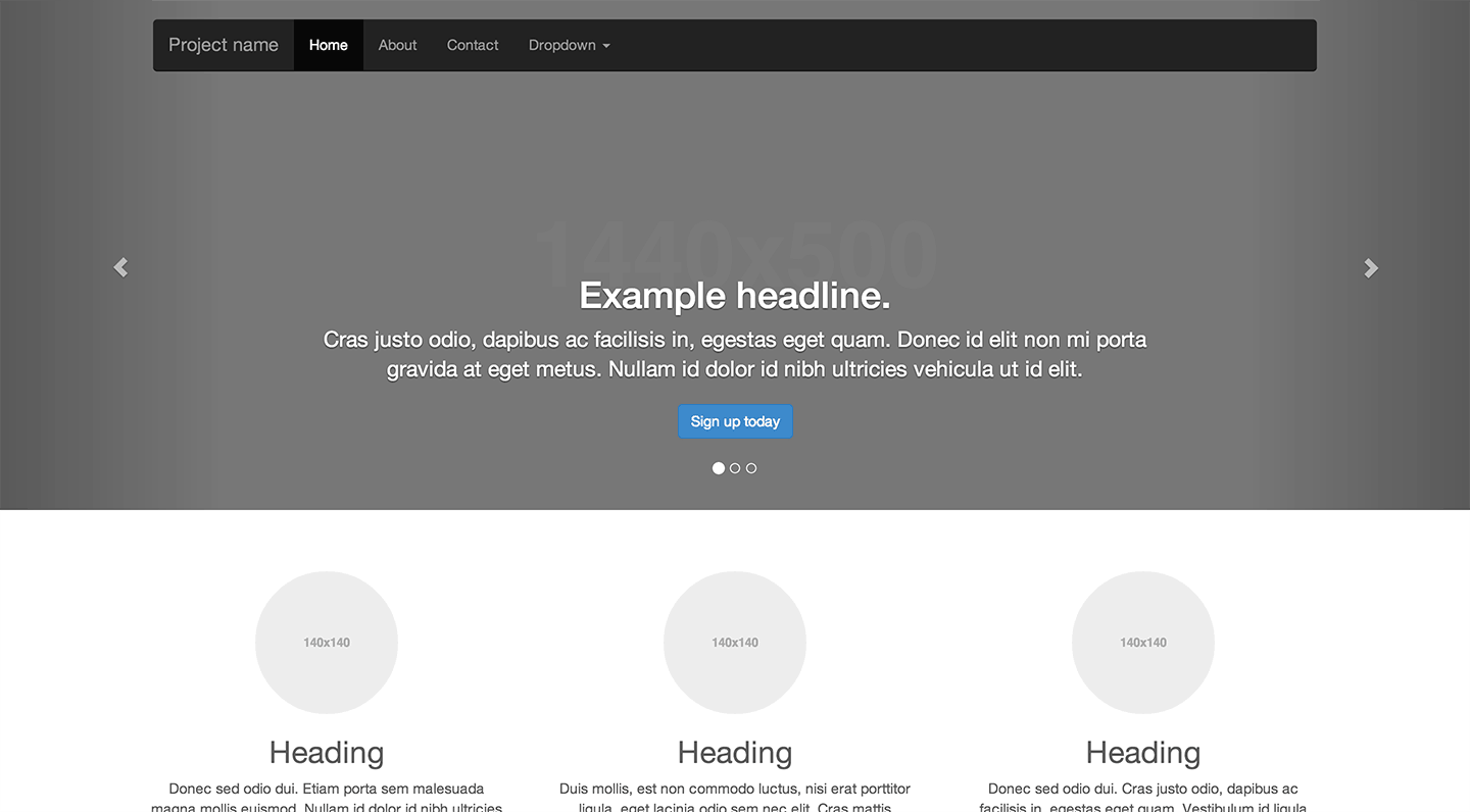
Carousel Slider Plugin Thing
I don’t have much to say about Bootstrap’s carousel, but I often get asked questions like, “How do I add a ‘slider’ to my website?” or “What’s the best jQuery carousel?” or some variation. It comes up frequently, so I just thought I’d point out that Bootstrap’s carousel exists and it’s pretty good, too. It has the little circles for pagination which are all the rage these days, and it even allows you to add captions. There’s also a really nice example where the carousel takes up the full width of the layout. Check it out:
Responsive Modals that Actually Work
Modal windows on webpages can be one of the most annoying experiences on mobile devices. The way they’re usually implemented causes this weird infinite scrolling effect on many mobile browsers, where when you try to zoom in or scroll the page to tap a button, the modal window changes size or moves around. It’s like one of those silly JavaScript demos from the 90′s where you try to catch a unicorn with your cursor but you can never quite click on it.
That’s why I was so happy to discover the beautiful responsive modals in Bootstrap 3. They’re built with mobile browsers in mind from the start, so if you decide to use a modal window, you won’t frustrate your site visitors with a cat and mouse zoom-and-scroll game.
Turn Off Responsive Features
Bootstrap 3 was designed with a mobile-first approach, but if you have more specific needs and responsive design doesn’t work, you can always turn it off. For example, perhaps you have a very specifically designed mobile experience that’s intentionally different from the desktop experience, and you want to keep them separated.
It’s not as simple as an off button, but just follow these step-by-step instructions and you can disable the responsive features of Bootstrap. Nice!
There’s lots more cool stuff to discover, so be sure to check out the Bootstrap site and read the docs. If you have any learnings or tips, share them in the comments!
No comments:
Post a Comment